Award Winners

This section of my portfolio showcases my award-winning pieces that were recognized at the 2023 ADDY Awards. These pieces represent my dedication to creativity and technical skill, and I am proud to have received recognition for my work. I hope that you enjoy browsing through these pieces as much as I enjoyed creating them.


Illustrations

Scherenschnitte and paper cutting, a traditional Swiss and German art form of intricate paper designs, has heavily influenced my approach to composition and design. In addition, my love for Superflat, a contemporary Japanese art movement, and my passion for visual novels inspired me to incorporate bold colors and flat, graphic shapes into my work


Graphic Design

Whether designing a brand identity or creating a layout for a print or digital piece, I approached each project with a particular understanding of the fundamental principles of graphic design. As an intern for several offices and organizations, I was responsible for creating graphics that communicated information in a clear and concise manner for their social media and educational materials.


Identity and Layout

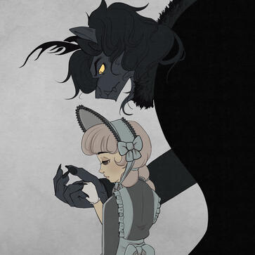
Beauty & The Beast

2023 Silver ADDY, Fresno AAF - Student Division
Illustration
Inspired by shoujo romance manga, I created two illustrations inspired by the classic tale of Beauty and the Beast. Taking my own perspective on the story's themes of sacrifice, freedom, and unexpected love, I sought to convey a varied range of emotions through my art.The first illustration depicts the scene of Beauty and the Beast's initial meeting. Here, Beauty appears sad and melancholic, her expression reflecting the weight of her decision to sacrifice her freedom for her father's safety. The Beast, on the other hand, is a dominating and imposing figure, his dark presence overwhelming the composition.In the second illustration, I aimed to capture a more positive and lighthearted moment between the two characters. Beauty is shown being pleasantly surprised by the Beast's romantic gestures, her flustered expression conveying a sense of unexpected attraction and affection. The composition and the elements of halftone-shading, flowers, and sparkles draw heavily from shoujo manga and its emphasis on emotional expression and romantic tension.

Draft Sketches

The Story

In a kingdom, distant and mystical, resided a prince by the name of Alexander. He was known for his unparalleled charm, immense wealth, and lavish lifestyle. Despite his exalted status, he treated those he perceived as inferior to him with contempt and disdain. One fateful night, a malevolent enchantress, placed a curse upon him, causing the cruel beast within him to emerge as punishment whenever his emotions of greed and rage consumed him.Having no control over his transformations, Alexander was shunned and abandoned by the majority of his court, condemned to live as a recluse in his castle. Years passed, and the kingdom became plagued by rumors of a monster terrorizing the land. The palace was abandoned, the prince was long forgotten, and many believed he had died.During this time, a troubled merchant returned from a failed trip to the city, finding out that his missing ships had been found, but their cargo had been heavily damaged. He risked going to debtor's prison and leaving his three unmarried daughters without his care. Before leaving, he asked each daughter what they wanted from the city, assuming they would be wealthy again. The oldest wanted beautiful dresses made from the finest fabrics, the second oldest desired jewelry, and the youngest, Fleurine, just wanted a rose and her father's safety.An intense storm struck the merchant, and he was thrown from his horse as he attempted to return home without the requested gifts. Tired and in desperate need of shelter, he miraculously stumbled upon a palace, where a young, handsome man allowed him inside. Over drinks and conversation, the merchant divulged his financial troubles and how he wouldn't be able to afford the gifts his daughters desired. To his surprise, the mysterious man offered the goods at no cost, simply for keeping him company for the night. The merchant was given lodging until the storm calmed down, and the next morning, he left without the chance to thank his generous and elusive host.As he was leaving, the merchant remembered Fleur's humble request for a rose and discovered a beautiful bushel of roses amidst the whithered plants in the garden. Just as he unmounted his horse and was plucking a flower, he was confronted by a beast. The beast exclaimed, "I've bestowed upon you many favors, and now you dare to steal from me?" The merchant mounted his horse and escaped the beast's grasp. But as he galloped away, the beast ominously growled that he would hunt him down and ensure he faced the consequences of his actions.Shaken and terrified, the merchant returned home, pretending that his trip to the city was a success. He gave his daughters their gifts, including the rose for Fleur. However, she sensed that something was amiss and could see the strain in her father's eyes. Later that night, she overheard her father confessing to his financial partner about the truth of his encounter with the beast, and his partner revealed the rumors of the cursed prince. In an effort to protect his daughters, the father requested that his partner take care of them since he was planning on returning to the beast the next morning.Guilt-stricken, Fleur decided to take her father's place as the sacrifice for the beast. She left a note for her father explaining her decision and departed for the palace, determined to face whatever lay ahead.


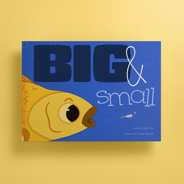
Big & Small Children's Book Cover

2023 Silver ADDY, Fresno AAF - Student Division
Publication Design

Originally created as a visual for a student assignment and editorial article, I repurposed this illustration for a children's book cover. I drew inspiration from my background in tutoring children in reading and I conducted research on existing book covers to ensure my design would appeal to young readers.My biggest challenge was figuring out the size hierarchy between the fish and the shrimp, and paralleling with the title text. In the end, my solution was to make this a spread from the front to back cover to push the concept of this simple story. Originally created as a visual for a student assignment and editorial article, I repurposed this illustration for a children's book cover. I drew inspiration from my background in tutoring children in reading and I conducted research on existing book covers to ensure my design would appeal to young readers.My biggest challenge was figuring out the size hierarchy between the fish and the shrimp, and paralleling with the title text. In the end, my solution was to make this a spread from the front to back cover to push the concept of this simple story.


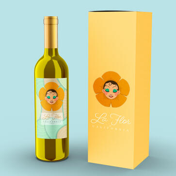
La Flor de California Wine Label

2023 Silver ADDY, Fresno AAF - Student Division
Silver ADDY, District 14 AAF
Packaging

La Flor de California came from an assignment in which we had to illustrate and design a fictional wine label. I decided to design an affordable label that celebrates the diverse and vibrant community of local California growers while specifically targeting Hispanic women.One of the main obstacles was simplifying the visuals to create a clean and concise design. This was my first semester working on a project like this after being accepted in the illustration track, and I had to learn the importance of keeping the design simple and not overcomplicating it. Despite this challenge, I was able to successfully create a design that effectively captured the vibrant essence of the brand.


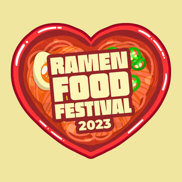
Ramen Food Festival Visual Identity

2023 Silver ADDY, Fresno AAF - Student Division
Gold ADDY, District 14
Silver National ADDY
Integrated Advertising Campaign

This project began as a study in which I explored drawing ramen dishes in various experimental illustrative styles. One of the pieces I created stood out to me, and I decided to develop it further into a brand identity for a fictional food festival. My objective was to establish a solid visual foundation for this event, with a particular focus on integrating key elements such as typography, the heart-shaped ramen bowl, and noodles into the mockups.As I worked on this project, one of the most significant challenges I faced was determining how to incorporate these elements in a way that would be visually appealing and cohesive. Despite this obstacle, I was able to create a brand identity that effectively communicates the essence of the festival and captures the attention of potential attendees. Overall, this project allowed me to showcase my skills in both illustration and branding.


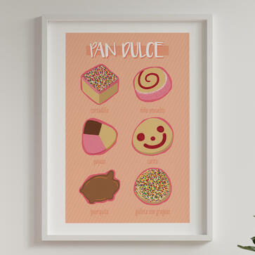
Pan Dulce

As a designer with a strong connection to my Hispanic background, I wanted to create a project that celebrated an important aspect of my culture: pan dulce, or sweet bread. I decided to design a poster that showcased six different types of pan dulce, each labeled with its Spanish name.Once the illustrations were complete, I carefully arranged them into a visually pleasing composition for the poster. I chose colors that were bold and bright, reminiscent of the vibrant markets and bakeries I'd go to with my family. I also created a washi tape design featuring the same pan dulce illustrations, which could be used to decorate notebooks, planners, or other items.

Washi Tape & Poster


Self Portrait

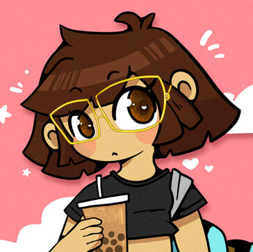
During my first semester in the Illustration track, I was assigned to create a self-portrait that showcases my unique style and interests. This illustration highlighted my love for the anime art style, as well as my personal interests.This self-portrait was not only a student assignment but also served as my profile picture for my art social media accounts. The use of vibrant colors and playful design elements helped to capture a cutesy and fun personality.

Closeups


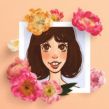
Shelley Duvall

Several years ago, when I was enrolled in the Illustration Techniques class assignment, I chose to draw Shelley Duvall using charcoal for an assignment. When I revisited the assignment, I wanted to take it to the next level by incorporating techniques I had learned from studying caricatures in my personal time.Rather than a straightforward portrait, I aimed to capture Shelley's distinct features in an exaggerated yet recognizable way. To do this, I experimented with soft colors and textures to bring out the character of the piece. The biggest challenge I faced was finding the right balance between my visual style and realism.

Closeup & Print


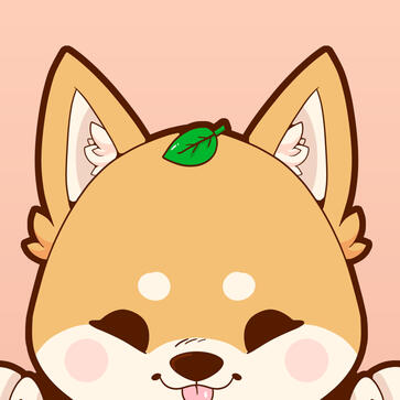
Peeking Shiba Inu

I was assigned to create an illustration meant to be applied to a mockup. The end result is an illustration of a cute Shiba Inu dog peeking at the viewer. The design is simple yet engaging, as the dog's playful expression invites the viewer to interact with it.The illustration is created using varied line weight. The thick and thin lines define the dog's outline and features.To showcase the illustration, I turned it into a mockup for a journal cover, which features the Shiba Inu on the front and has space for writing and drawing inside. The journal is designed to inspire creativity and imagination, inviting the user to write down their thoughts, ideas, and memories while enjoying the cute and playful dog on the cover.

Journal


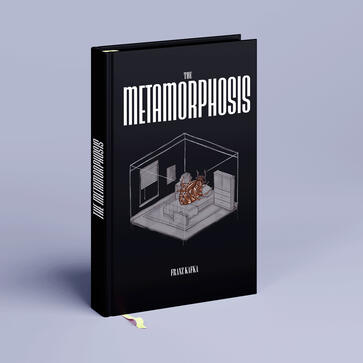
The Metamorphosis

The goal of this project was to create a book cover and interior illustration for an existing book. I picked Franz Kafka's novel, The Metamorphosis. As a fan of the story since high school, I was drawn to the challenge of visually interpreting the surreal and unsettling nature of the narrative.For the cover, I depicted the protagonist, Gregor Samsa, transformed into a cockroach and lying on his bed. I aimed to stay true to the story's descriptions of his room. I rendering the furniture in gray and the walls transparent in an orthogonal perspective to convey the discomfort and helplessness of his situation.For the interior illustration, I chose a scene early in the book where Gregor's family discovers his transformation just partially hidden behind the doorframe. I aimed to capture the shock and revulsion of the moment.

Book Cover & Interior

Closeup


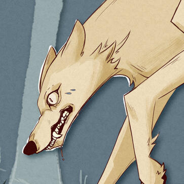
The Wolfhound

I was assigned to create an illustration meant to be applied to a mockup. The end result is an illustration of a cute Shiba Inu dog peeking at the viewer. The design is simple yet engaging, as the dog's playful expression invites the viewer to interact with it.The illustration is created using varied line weight. The thick and thin lines define the dog's outline and features.To showcase the illustration, I turned it into a mockup for a journal cover, which features the Shiba Inu on the front and has space for writing and drawing inside. The journal is designed to inspire creativity and imagination, inviting the user to write down their thoughts, ideas, and memories while enjoying the cute and playful dog on the cover.

Closeup & Print


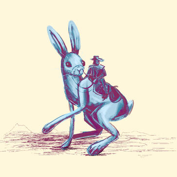
Rabbit Cowboy

This illustration is rendered in a painterly style, with soft shading and subtle gradients adding depth and texture to the image. This style is a departure from my usual approach, and I enjoyed the challenge of exploring a new technique. This illustration came from an exercise where I had to illustrate a creative mode of transportation.

Closeup


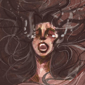
The Opera Singer

I continued to build on a painterly and impressionistic art style with this illustration. The rough and square digital brushes I experimented with allowed me to create bold lines with a dynamic and expressive feel that complemented this project.


Virtual Avatar

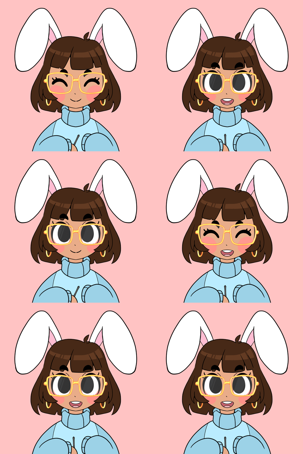
One of the most unique pieces in my illustration portfolio is an avatar that I created for my live-streaming sessions. While I enjoyed the interaction and engagement of live streaming my illustration process, I found it difficult to balance being presentable on camera with being able to focus on my work.To solve this problem, I created an avatar that represented me, allowing me to maintain a connection with my viewers while also remaining focused on my artwork. I imported the avatar frames into a software called Veadotube Mini, which allowed me to customize its behavior. The avatar would periodically blink and change to an open-mouthed frame when it detected audio input, making it seem more alive and responsive to my viewers.Overall, this piece represents my ability to adapt and find creative solutions to the challenges that come with being a professional illustrator in a digital age, and my willingness to experiment with new tools and technologies to achieve my artistic goals.

Frames


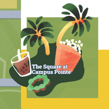
Campus Map

The Collegian and Student Affairs office at Fresno State conducted an open-call to engage artists and designers in helping with a special edition of the student newspaper aimed at incoming freshmen and transfer students. Both departments selected me to illustrate a playful campus map. This map highlights crucial student-use areas with an emphasis on simplicity identifiability. The project came with a demanding deadline, which provided a valuable opportunity to grapple with the task of simplifying the intricate architecture of campus buildings while ensuring they remained easily recognizable to our target audience. This experience was both challenging and rewarding.

Illustration

Illustrated Icons


"I'm A Healthy Bulldog!" Coloring Book

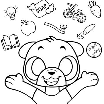
My collaboration with the Student Affairs office at Fresno State on the campus map was so successful that they sought my artistic skills once again, this time for a children's coloring book for Fresno State parents to gift their kids. This project entailed creating illustrations to complement a story written by Marisa Mata. One of the most notable obstacles I encountered was keeping the uniformity of the bulldog character throughout the book, with the added challenge of illustrating this character in 15 distinct settings and scenarios. This experience allowed me to refine my skills with children's illustration and adapt to diverse creative demands.

Notable Illustrations


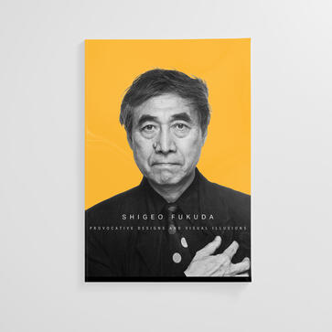
Shigeo Fukuda Magazine Essay

For my History of Graphic Design class, I wrote about the life and work of Shigeo Fukuda, a highly influential Japanese graphic designer. Fukuda was known for his commercial work for the 1970 World's Fair and UCC Coffee. He was a master of optical illusion and used negative space in innovative ways to create memorable and impactful designs.For this project, I used Adobe InDesign to lay out my essay in a magazine-style format, incorporating images of Fukuda's work alongside my analysis and research. To draw attention to some of his most notable quotes, I made them stand out by using bold, bright yellow, and a sans serif font.Overall, this piece showcases my ability to combine my passion for graphic design with my writing skills and demonstrates my proficiency in using Adobe InDesign to create visually engaging and dynamic layouts.

Magazine Mockup


Pawsearch Mock App

I was assigned to design and prototype a fictional app on Adobe XD. The app I created, called "Paw Search," aimed to connect people who want to rehome and adopt pets from shelters, while also incorporating a social media aspect for users to share stories and photos of their furry friends. For the app icon, I designed a paw, surrounded by an outline that looks like a speech bubble, representing the app's mission to connect people and facilitate conversation. As part of the assignment, I researched other apps and their design principles, created ideation sketches, developed personas, and created an app map to ensure a smooth and intuitive user experience. This project demonstrates my ability to apply design principles to a digital medium, as well as my attention to detail and user-centered approach to design.


Bunny Delight Designs

Preliminary Designs

Final

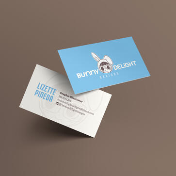
Bunny Delight Designs became my new identity that built upon my previous self-portrait to create a more engaging and memorable visual brand. The core visuals from my previous depiction of myself are still present, but have been updated and refined to reflect my evolved style.One of the biggest challenges I faced in creating this new identity was choosing the right color palette. Ultimately, I settled on a soft blue and white that create a welcoming and calming feel. By using brown as a neutral color instead of black, I was able to create a more approachable and friendly tone for my brand.


J-Fashion Fresno

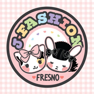
J-Fashion Fresno comprises a tight-knit community of Japanese street fashion enthusiasts who regularly gather to embrace the vibrant culture of Fresno. Our meetups take us to various local destinations, including restaurants, arcades, and parks. As an active member of this group, I offered to design a logo that encapsulates our group's essence – something that is charming, playful, and mirrors our shared enthusiasm.

Nice to meet you!

Hi there! My name is Lizette Pineda. I am an award-winning designer and illustrator. I specialize in whimsical and playful illustrations aimed at younger audiences. Although most of my experience is in graphic design, I have a high interest in working for publishers and children's illustration and media. Please contact me if my work interests you. I look forward to working with you.

My style at a glance


Testimonials

"Fresno State’s Division of Student Affairs and Enrollment Management (DOSAEM) is committed to helping students reach their full potential, supporting them in academic, personal and professional development. As DOSAEM’s communications coordinator, I oversee division-level communications, including our coloring book series, which was one of multiple initiatives to increase resources, accessibility and a sense of belonging on campus for parent scholars and their families. I invited Lizette to be a part of this project because she had previously contributed to an on-campus publication and I admired her use of color and overall style—I also looked into her online portfolio and admired the range apparent in her past projects. The different levels of detail in her projects assured me that she would be able to illustrate for any children’s age that we needed to target. As we worked together for the coloring book, Lizette was always professional, open to direction and feedback and took initiative. I would work with her again if the opportunity presented itself."
- Marisa Mata, DOSAEM’s communications coordinator


It would be a pleasure to connect with you! Feel free to contact me directly with any questions regarding my work or project proposals.

Email is the best way to reach me, but you can also find me on my socials below


Instagram

@bunnydelightdesigns

Email

[email protected]


Disclaimer: Please do not use my e-mail to start unrelated conversations or spam. My email address is for projects inquiries or serious concerns only. You are welcome to contact me directly on my social media if you want to say hello!